Equity Compensation Planner
A tool that enables stock planners to have an insight-driven conversation with clients.

Introduction
The private wealth team introduced a service focused on providing clients an in-depth analysis of their employer provided stock options. This analysis was done by stock planners by using a third-party tool. A forecasted rise in client requests for this analysis, along with the limitations of the current tool, paved the way for an in-house stock planning application: Equity Compensation Planner. The primary goal of this application was to improve planner efficiency and provide a tool that will help them turn client data into multilayered stories.
To comply with my non-disclosure agreement, I have omitted and obfuscated confidential information in this case study. All information in this case study is my own and does not necessarily reflect the views of Fidelity Investments.
Diving into the Deep end…
I came into this project with no understanding of stock reward planning and by the second meeting it was clear that I would need to breath and talk – stock awards, to be able to bring the application to life. To ramp up quickly, I requested to do a guerrilla ethnography - ie spend a week deeply shadowing a planner as they did a client analysis. While going through this exercise, I started to put together a journey map to visualize various stages, touch-points and documented pain-points as I saw them.
Making sense of the what
A week later I was definitely more confident about what I was dealing with and started to organize my learnings into high level themes. This also help to construct high-level need statements for the 2 key persona’s we were supporting via this tool.


Key personas and themes from guerrilla ethnography mapped in mural
The kickoff…
I was invited to a 1-day technical kickoff workshop to share and validate my findings from the ethnography. While these findings were not new for the stakeholders, it helped the project and dev teams to empathize and understand the requirements better. Considering this project was a ground up effort it was decided that project would be tackled in 2 parts -
Part 1: Reworking the Report output
Part 2: Equity compensation planner
Since access to the right data-services and APIs was key to building out this application, it was decided that I would start out by focusing on the analysis and final report output, while the project team did a deep review of all services they would need to support to modeling Monte Carlo or Black Scholes type analyses.
PArt 1: Reworking the Report OutpUt
Understanding the report
Using the existing report as a starting point, I setup a bi-weekly session with a stock planner to better understand the context and content of the report. We worked page by page, asking the same set of questions each time –
What is the story you want to tell your client about his/her stock awards?
What is the goal of this page?
What strategic insight can we bubble up to the top?
What key takeaways can a novice as well as expert client walk away with?

The old report
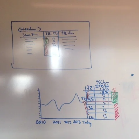

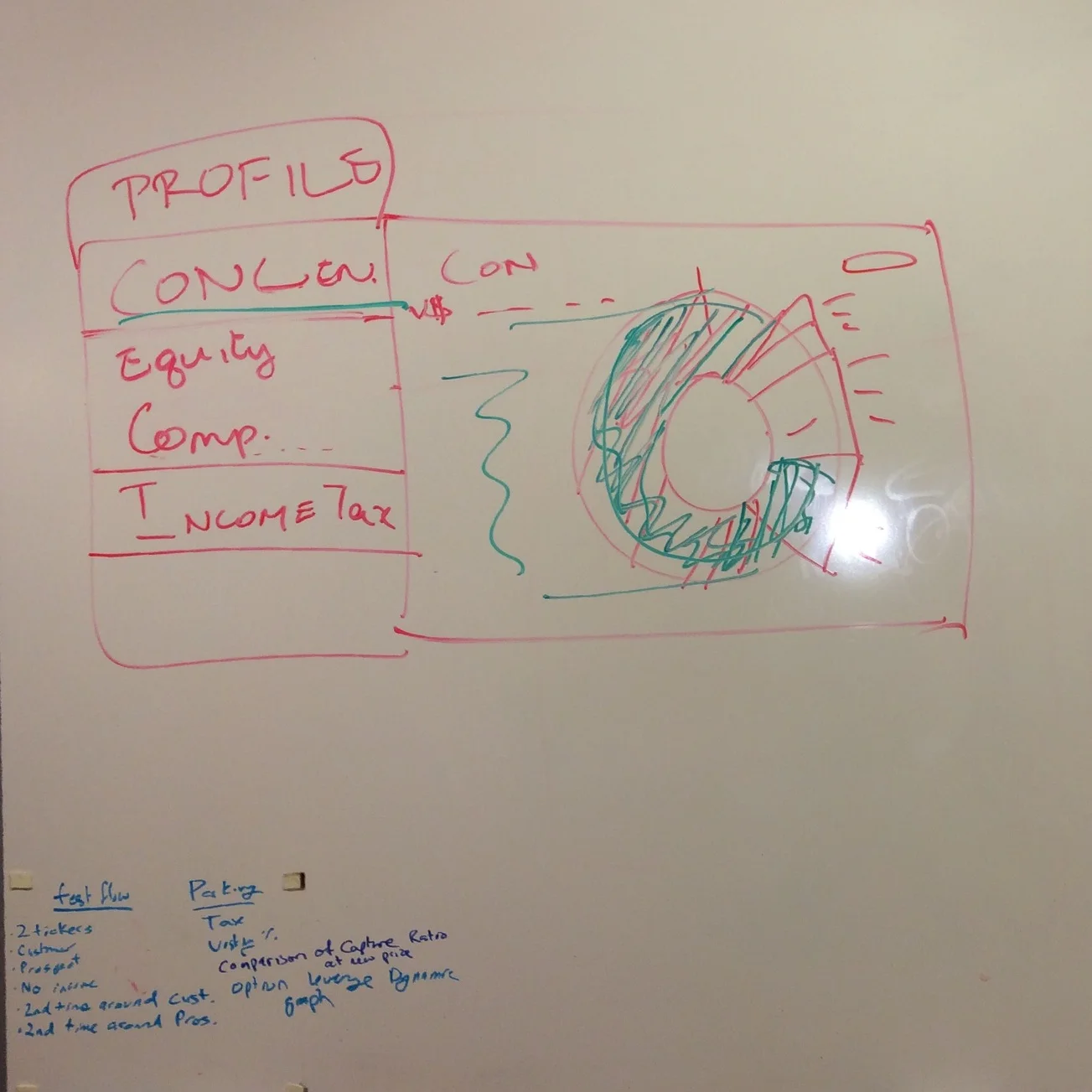
White-boarding options leverage and shares sensitivity in a working session with planners.
Visualizing data
These working sessions fueled the next step in the process. I framed a hierarchy of elements that I wanted to visually emphasize and then drafted different explorations of charts.To ensure that these visualized representations also work in a digital context, I mocked up some of these charts in Microsoft PowerPoint to test for easy and simple interactive.
Usability and validation
An Axure prototype of the report was tested in a moderated usability study with planners. Feedback from the study helped with overall content legibility, flow of the conversation and finally confirmed which of the visualizations helped support the conversations the planners were having

Feedback from a moderated usability test of the report
The Final Report
Once the feedback from the usability session was incorporated, I handed over the finalized designs to the visual designer supporting the project. He worked on aligning the report to the business unit’s brand and visual palette while I transitioned to work on the application.
Part 2: Equity Compensation Planner
To refocus my efforts on the application, I started out by creating a user flow to articulate my understanding of a planner’s sequence of tasks before running an analysis and when sharing the analysis with a client. This flow laid the foundation of the navigation and information architecture of the application.
The planner interface
In a working session with the business, I shared and confirmed the task flow and then captured all elements that need to be accounted for. With this information at hand, I quickly jumped into Figma to create low and high fidelity screens of the interface. To make sure I was keeping the stakeholders closely involved in the process, I setup a bi-weekly review session with a couple of stock planners to validate my direction.
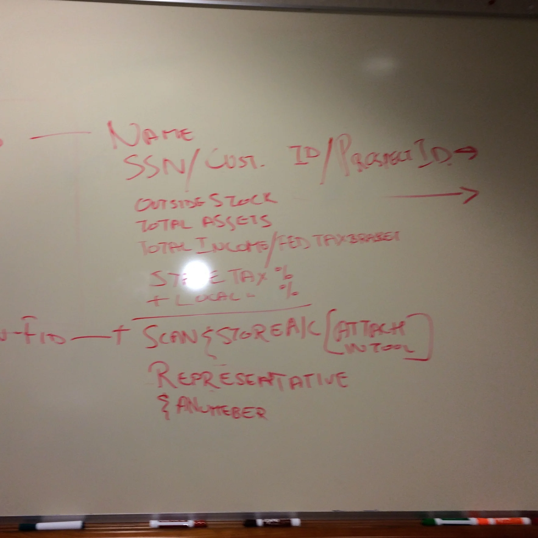
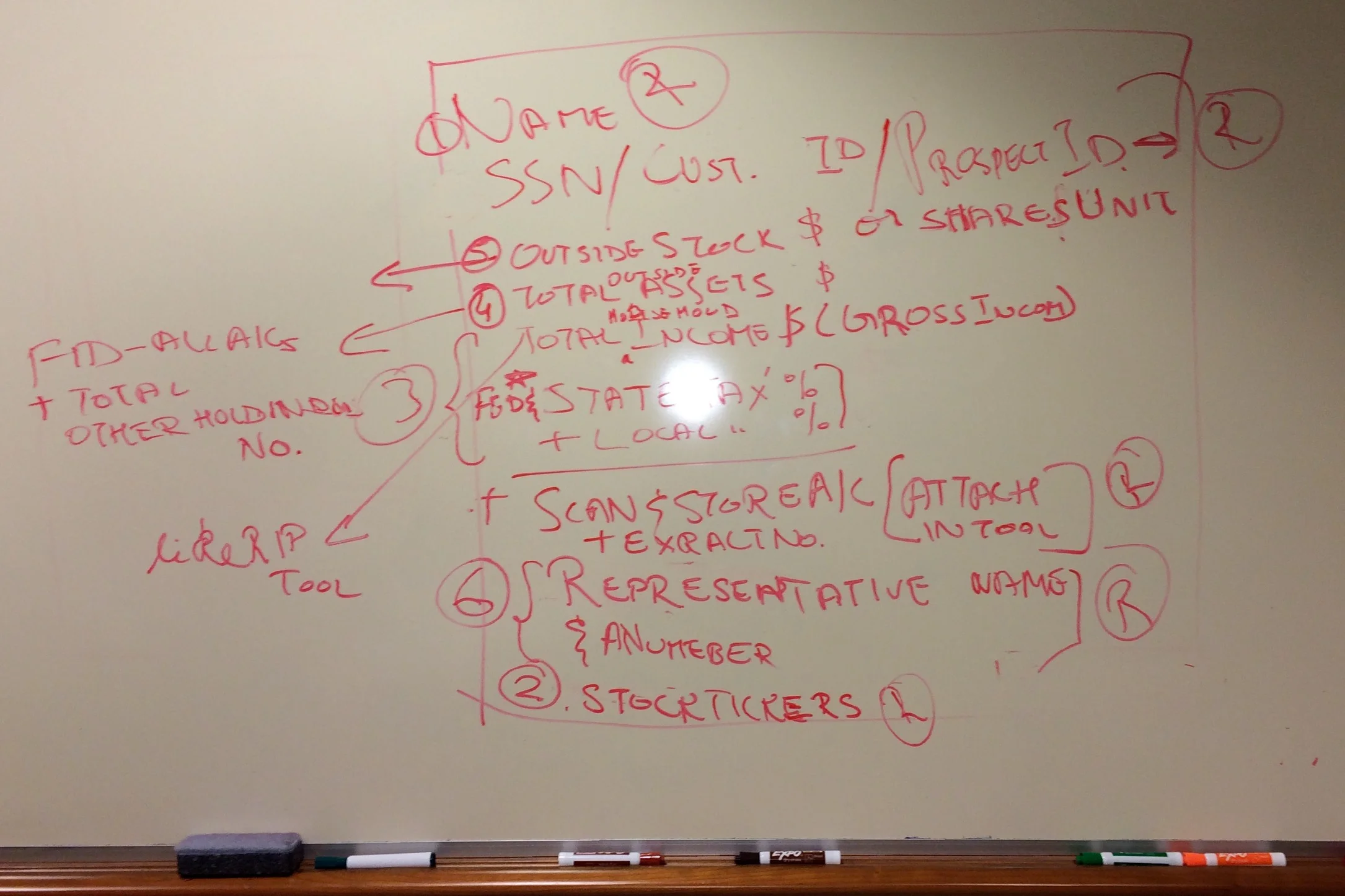


Screenshots of the whiteboard from the working session that I then translated into low fidelity mockups.
Testing with the experts
To make sure my designs covered all uses cases, stories and contexts, I partnered with a user researcher to conducted multiple rounds of moderated usability studies.


These were unlike traditional usability tests since the context involved users who have deep domain knowledge and have already learned to use a similar system through a previous learning period. Different edit states and interactive visualizations were tested to identify issues in the UI, interaction flow and content. Working iteratively, I folded in solutions for all interaction and content related issues and all other recommendations were documented in a backlog for future iterations.
Once we arrived at a point where the stakeholders were comfortable with the proposed experience. I handed over my designs to the visual designer to create detail specs for the various screens.
Key features of the equity compensation planner


Snapshot
The Snapshot provides planners an all-inclusive view of the client information available. In the case of existing clients this view provides planners a view of when the last report was generated and the vesting schedule and other awards info. Each view of the application is customized to the user in context.
Profile
The profile section of the applications pulls in client or prospect information. This is an aggregated view of information collected during the intake process and info housed Fidelity’s backend systems.
For a deeper analysis Planners can update or add additional info such as a spouse’s income, if available.


Stock exposure
Planners spend most of their time in the stock exposure section. The layout allows for a high-level view of all awards and the ease to drill into the individual awards if need be.
Expert planners can edit dates, price and quantity based on which the final value is automatically calculated. For clients who don’t have all their stock awards at Fidelity – the Add another Ticker allows planners to manually enter the information.


Analysis
Planners use this section to drive the conversation in a client meeting. Visualizations specific to Share Sensitivity & Options Leverage help explain impacts of market fluctuations on client’s net worth.
In addition to running an analysis, this section also lists all the previously generated reports.
For planners using an iPad during an analysis, a responsive view of the analysis section was created that could be easily accessed via an iPad.
Intake Form
This simple form formalizes the process of collecting client information when a request for analysis is initiated. This alleviates the need for repeated email back and forth with the front office advisors. Data entered on this from feeds into back-end systems that house client and prospect information.
Additional Screenshots of the Application

In Closing…
The application has been in production for 3 years now and improved stock planner productivity. They are now completing the analysis in 2 days - well within SLA requirements (which is 5 business days).
The stock plan services team has seen a 10% increase in the number of report requests coming in.
Stakeholder and client feedback
“That tool and report are the greatest thing since sliced bread!”
Chris Russo, Director, Wealth Planning Services and the original sponsor of this project.
“I don’t know how you guys put this report together but the timing is impeccable and the report is a major help in making my decisions”
Customer feedback recently received via his Financial Advisor